Unconventional Data Analysis: extracting test bench results with Python
A practical example of how to use Python to analyze the results of an experimental test consisting of a sequence of stationary points


A simple approach to extract information from a sequence of test points
Every time we use sensors and transducers to measure a physical system we'll end up with messy data. Having worked as a Testing and Validation Engineer on different projects, I have experimented with different ways to post-process such data to get usable information from it. I've shown an example of how to use MATLAB to analyze data from a race car.
Today I want to share an example of how Python can be used to analyze the results from a test bench run consisting of a sequence of stationary points with variable dwell time.
This is a very common task in different sectors, so I hope you'll find it interesting. However, the approach I'll be using is a bit of an alternative way to what most people would do, and the applicability is limited.
A practical example
Suppose we run a short test to compare the measurements from an oil pressure sensor against a reference instrument.
We are using a small oil circuit that we can control, and we are able to impose reference pressure values.
During the test, we performed a sequence of 6 stationary points at constant pressure and recorded the measurements of both instruments. The duration of the test points is not constant. We want to know what's the difference in pressure measured by the sensor and the reference transducer for each of those test points.
Test recordings
The data are stored as two separate CSV files, which is actually not the case for most modern test automation or data acquisition systems. However, I chose to use CSV files to generalize the idea.
I obtained these from an actual test, but I’ve removed other information keeping only the pressure values.
These files contain +29k rows of data each one, so dealing with them in Excel can be a bit cumbersome. Let's see how we can work with these files in Python.
First, we import the libraries we are going to use and read the data from the CSV files. Here, I'm using 3 very common Python libraries:
- Pandas: a data analysis and manipulation tool - we'll use it to handle the tabular data
- Numpy: for numerical operations
- Matplotlib: used for generating figures
# Import libraries and lod data
import pandas as pd
import numpy as np
import matplotlib.pyplot as plt

sensor = pd.read_csv('Sensor_data.csv')
reference = pd.read_csv('Reference_data.csv')
Next, it's good practice to get a bit of information about what we just imported. The data has been stored as pandas dataframes so that we can use Pandas' methods for this.
# See the first 10 rows
print(sensor.head(10), '\n')

# Retrieve information about the data types and number of non-null elements
print(sensor.info())
We get the following:
      press  time
0  0.030678  1.29
1  0.031357  1.30
2  0.031357  1.31
3  0.031028  1.32
4  0.030898  1.33
5  0.030927  1.34
6  0.031510  1.35
7  0.030630  1.36
8  0.030991  1.37
9  0.030536  1.38

<class 'pandas.core.frame.DataFrame'>
RangeIndex: 29709 entries, 0 to 29708
Data columns (total 2 columns):
 #   Column  Non-Null Count  Dtype
---  ------  --------------  -----
 0   press   29709 non-null  float64
 1   time    29709 non-null  float64
dtypes: float64(2)
memory usage: 464.3 KB
None
Great, so we know the data has two columns, time and pressure measurements. The values are encoded as double-precision point numbers (float64), and there are 29709 rows.
If we do the same with the reference data frame, we will see that the number of elements is the same and the time base is the same. This is not always the case! I aligned the recordings from two different acquisition systems in order to make this blog post more concise. That is something I will go through in a different post.
Let's go on knowing that there's a data synchronization step that's already been done - we want to focus on how to get useful results once we have "usable" data.
Creating a figure
We want to compare the data measured by both instruments. The simplest way to do this is to represent them on the same time base. We could also plot the difference between them over time.
Here below is a short script that does just that.
# Create a figure
fig, ax1 = plt.subplots()

# Plot the pressure values.
ax1.plot(sensor['time'], sensor['press'], 'r', label = 'Sensor')
ax1.plot(reference['time'], reference['press'],'k', label = 'Reference')
plt.grid(which = 'both')
ax1.set_xlabel('Time [s]')
ax1.set_ylabel('Pressure [barG]')
plt.legend(loc = 'upper left')

# Create another set of axes sharing the same x-axis (time base)
ax2 = ax1.twinx()

# Compute the offset between the two measurements
deltaP = reference['press'] - sensor['press']
# Filter and scale
deltaP = deltaP.rolling(window = 150).mean()*1000

# Apply same color to data in the secondary axis for readability
color = 'tab:blue'
ax2.plot(reference['time'], deltaP, label = '$\Delta$P', color = color)
ax2.set_ylabel('$\Delta pressure [mbarG]', color=color)  # we already handled the x-label with ax1
ax2.tick_params(axis='y', labelcolor=color)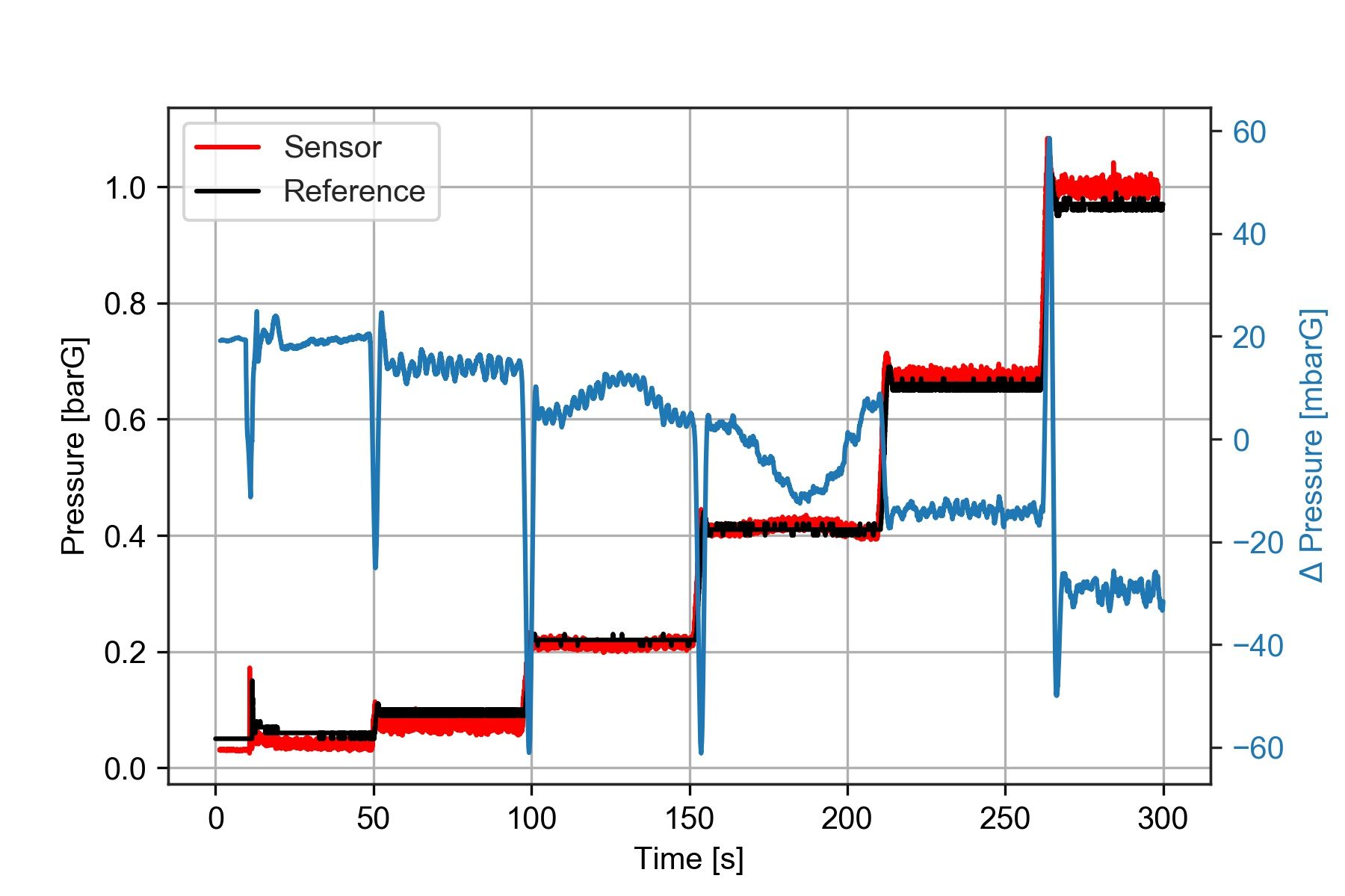
Notice that I smoothed out the offset between the two sensors using deltaP.rolling(window = 150).mean()*1000 what this does is apply a moving average filter with a window size of 150 samples.
I've mentioned before that moving averages are not always a good idea. In this case, we just need to remove the noise, so it is pretty safe to use.
The plot shows that the pressure difference during the third and fourth test steps is not constant. So we already know there is something to investigate about those two points.
We want to determine what is the central value of this pressure difference for each one of the test steps.
Computing the result for each test step
A common method would be using time intervals to determine the location of the test steps. This would be like looking at the data and saying "There is a test step between 50 and 80 seconds, and another one between 110 and 150 seconds", and so on. Then we would index the samples for each test step based on those timestamps and compute the mean values.
This approach is good because we can remove the transient part between one test step and the other.
However, I will show you a different way of getting the results at each test point, which is way easier to implement. It is based on pressure values instead, and we will use classic statistics to get the information we need.
It requires two steps:
- We will discretize our reference pressure data into bins corresponding to the stationary points used during the test.
- Then we'll use this discretized data to find the median value for each test point.
I'm going to show two slightly different ways of doing this. One is based on Numpy, and the other is based on Pandas. Both give the same results, the second one is incredibly short.
Using Numpy histograms
Numpy has built-in methods that we can use for discretizing our data and finding the results at each test point.
To discretize our data, we need to create a histogram, which returns the number of bins and the count of samples for each one:
# How many bins are we using to discretize out data
n_bins = 30

# Discretize the data into bins of uniform size
bin_counts, bin_edges = np.histogram(reference['press'], bins = n_bins)
print('Counts: ', bin_counts, '\n')
print('Edges: ',bin_edges, '\n')

# Find the centers of the bins
bin_centers = bin_edges[0:-1] + (bin_edges[1:]- bin_edges[0:-1])/2
print('Centers:' ,bin_centers)
Counts: [4992 4724 64 66 57 5191 31 40 30 25 77 5596 25 21
20 26 25 21 4797 145 22 15 25 15 15 13 22 700
2783 126]
Edges: [0.05 0.08266667 0.11533333 0.148 0.18066667 0.21333333
0.246 0.27866667 0.31133333 0.344 0.37666667 0.40933333
0.442 0.47466667 0.50733333 0.54 0.57266667 0.60533333
0.638 0.67066667 0.70333333 0.736 0.76866667 0.80133333
0.834 0.86666667 0.89933333 0.932 0.96466667 0.99733333
1.03 ]
Centers: [0.06633333 0.099 0.13166667 0.16433333 0.197 0.22966667
0.26233333 0.295 0.32766667 0.36033333 0.393 0.42566667
0.45833333 0.491 0.52366667 0.55633333 0.589 0.62166667
0.65433333 0.687 0.71966667 0.75233333 0.785 0.81766667
0.85033333 0.883 0.91566667 0.94833333 0.981 1.01366667]This whole bunch of numbers is confusing at first. However, if we look at a histogram plot containing the same bins, we'll see why doing this is helping us get the test points:
fig = plt.figure()
plt.hist(reference['press'], bins = n_bins)
plt.xlabel('Pressure [barG]')
plt.ylabel('Count')
plt.grid(True)
plt.title('Distribution of reference pressure during the test')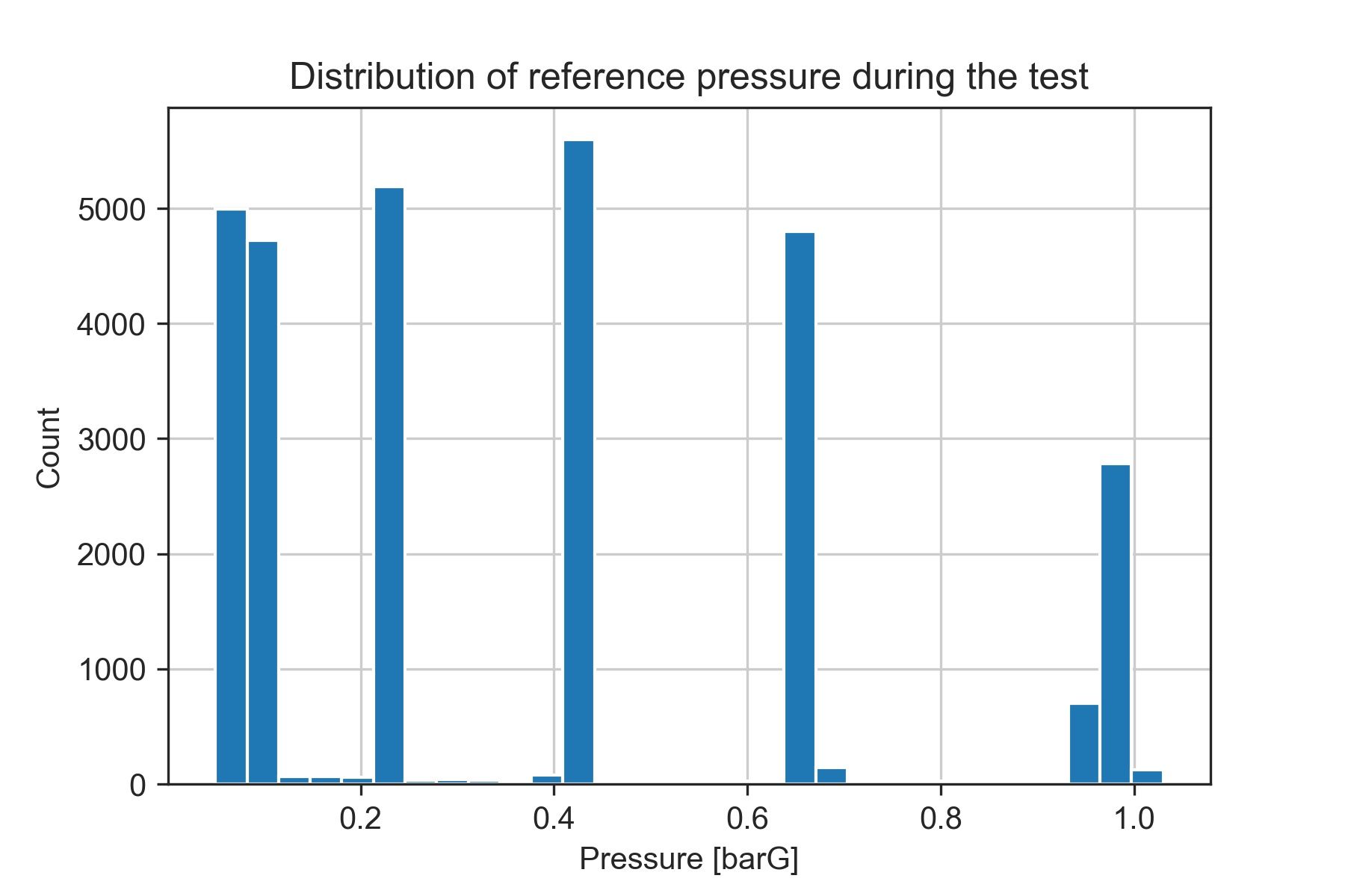
The 6 bins with the highest count of samples match our test points. This is because they are stationary points at which the reference pressure (the data we are using for discretizing) is almost constant.
Now, let's extract the information from the data contained within those bins.
# Define how many points we want to extract
n_poits = 6

# Find the n_points bins with the highest count of samples
top_counts = np.flip(np.sort(bin_counts)[-n_points:])

# Get the indices of the bin edges containing the test points
indices = np.where(np.in1d(bin_counts, top_counts))[0]

# Find the bin edges of interest
edges = [(a,b) for a,b in zip(bin_edges[indices], bin_edges[indices+1])]

# Print the edges rounded with 3 decimal points
print(np.around(edges,3))
[[0.05 0.083]
[0.083 0.115]
[0.213 0.246]
[0.409 0.442]
[0.638 0.671]
[0.965 0.997]]The results we obtained seem consistent with our data. We can compare them visually by plotting the location of the identified test points over the pressure axis in the previous figure.
# Create a figure
fig, ax1 = plt.subplots()

# Plot the reference pressure values
ax1.plot(reference['time'], reference['press'],'k', label = 'Reference')
ax1.set_xlabel('Time [s]')
ax1.set_ylabel('Pressure [barG]')

# Visualize the bins containing the test points
for a,b in edges:
  ax1.axhline(y=a, linestyle='-', linewidth = 0.75, color = 'b', alpha = 0.5)
  ax1.axhline(y=b, linestyle='-', linewidth = 0.75, color = 'r', alpha = 0.5)

plt.title('Identified test points')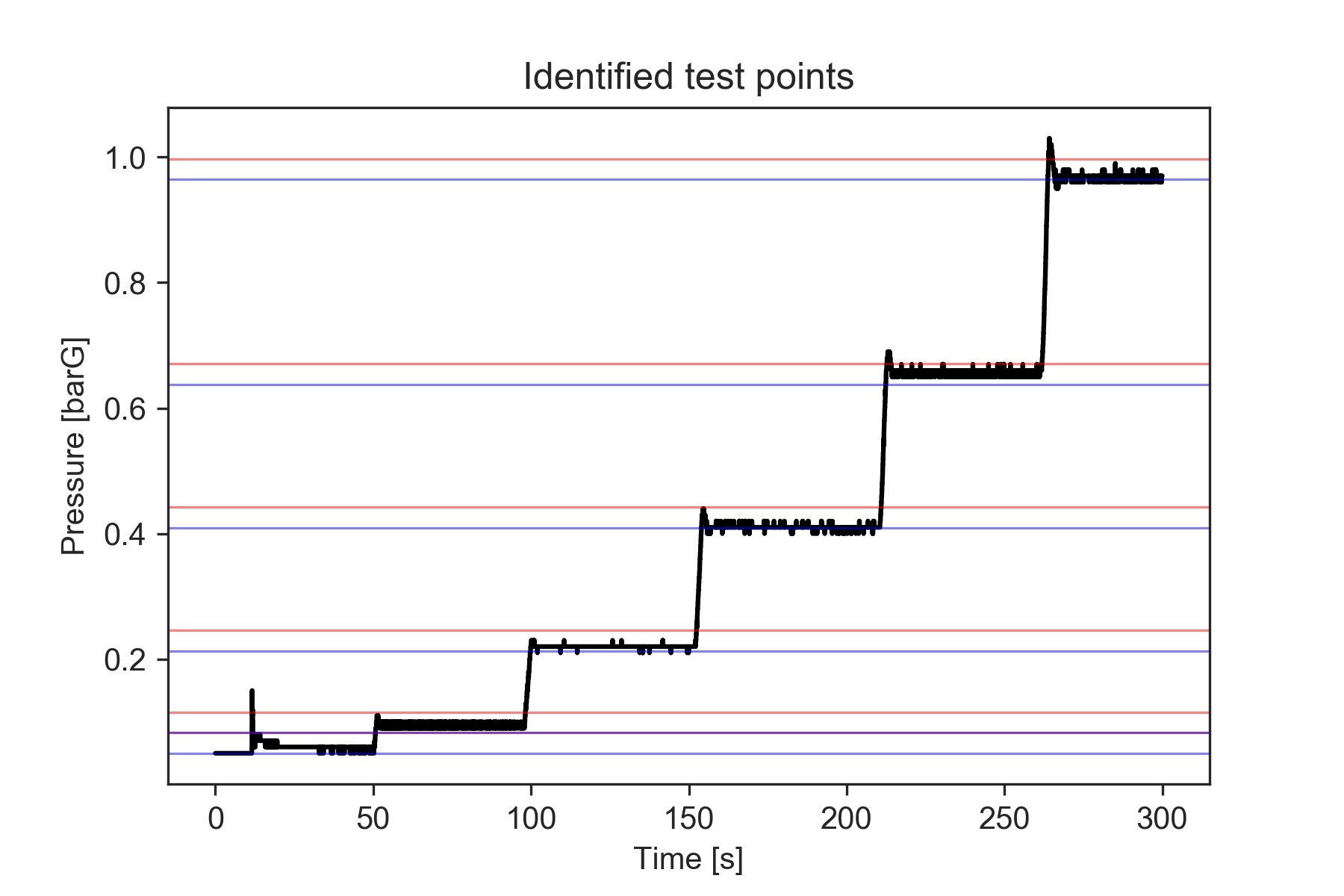
Finally, we can obtain the actual deltaP values by computing the median for each of those bins.
results = []
for low, high in edges:
    index = np.where((reference['press'] >low) & (reference['press']<= high))
    results.append(np.median(reference['deltaP'].loc[index]))

print('deltaP at each test point:', np.around(results, 3))
deltaP at each test point: [ 19.159 14.094 6.902 -3.194 -14.071 -29.019]Great, we have turned test recordings into information we can actually use.
Now let's see a different and more concise way of doing this.
Using Pandas and aggregations
With Pandas, we can get the same results we saw before, only with fewer lines of code.
First, we need to add the deltaP array to our reference data frame.
Then we will discretize the entire data frame using pd.cut . The output from this method is an array with the corresponding bin for each sample.
For convenience, we will assign it to a new variable in the data frame.
reference['deltaP'] = deltaP
reference['bin'] = pd.cut(reference['press'], bins=n_bins, )
reference['bin']
0 (0.049, 0.0827]
1 (0.049, 0.0827]
2 (0.049, 0.0827]
3 (0.049, 0.0827]
4 (0.049, 0.0827]
...
29704 (0.965, 0.997]
29705 (0.965, 0.997]
29706 (0.965, 0.997]
29707 (0.965, 0.997]
29708 (0.965, 0.997]
Name: bin, Length: 29709, dtype: category
Categories (30, interval[float64]): [(0.049, 0.0827] < (0.0827, 0.115] < (0.115, 0.148] < (0.148, 0.181] ... (0.899, 0.932] < (0.932, 0.965] < (0.965, 0.997] < (0.997, 1.03]]This makes things easier for us because we have both the data and the bin it belongs to contained in the same place.
Now we can use other methods to group the data based on the bins and then perform operations for each group.
# Group data by bins and compute the median value for each bin
ref_stats = reference.groupby(['bin']).median()

# Store the count of values for each bin
ref_stats['counts'] = reference.groupby(['bin']).count()['press'].values

# Get the n_points rows with the highest counts
results = ref_stats.nlargest(n_points, columns = 'counts')

# Then sort them in increasing order by timestamp
results = results.nsmallest(n_points, columns = 'time' )
print(results)
And finally, ecco qua:
                 press      time     deltaP  counts
bin
(0.049, 0.0827]   0.06   25.5345  19.212233    4992
(0.0827, 0.115]   0.09   74.3705  14.094333    4724
(0.213, 0.246]    0.22  126.1000   6.901974    5191
(0.409, 0.442]    0.41  182.3550  -3.194196    5596
(0.638, 0.671]    0.66  237.7100 -14.070790    4797
(0.965, 0.997]    0.97  282.4400 -29.019471    2783
I like this method because it's very straightforward, and gives me all the information I need concentrated in a single place.
I can actually just export all the results to an Excel file, using results.to_excel('my_results_file.xlsx'), which is very convenient when making reports.
Why use the median instead of the mean
The median is a more robust indicator of centrality when analyzing the distribution of data.
We are using pressure bins instead of precise time steps to determine what samples represent each test point. Thus, we may accidentally include samples corresponding to the transition from one test step to the next one.
Those points would be outliers.
If we were calculating the mean over all the samples within each bin, an excessively high or low value deltaP would have a large influence on the result. Instead, by computing the median, we can minimize the impact of any outliers.
If you are interested, you can see a more detailed explanation of this in this post published on Statology.
What about the points with non-steady pressures?
We mentioned before that it was worth having a deeper look at one of the test steps where the pressure measured by the sensor was not really constant, producing a large variation in the deltaP for that reference pressure value.
Let's plot the data corresponding to the bin we are interested in. I'll go back to using Numpy here, but we could also do it with the reference dataframe, since we have the 'bin' column.
fig, ax = plt.subplots()
interval = pd.Interval(0.409, 0.442, closed='right')
snsr_range = sensor.loc[reference['bin'] == interval, 'press']
ref_range = reference.loc[reference['bin'] == interval, 'press']
deltaP_range = reference.loc[reference['bin'] == interval, 'deltaP']

# Plot the pressure values for the range of interest
ax.plot(snsr_range, 'r', label = 'Sensor')
ax.plot(ref_range,'k', label = 'Reference')
plt.grid(which = 'both')
ax.set_xlabel('Time [s]')
ax.set_ylabel('Pressure [barG]')
leg = plt.legend(loc = 'upper left')
leg.remove()

# Create another set of axes sharing the same x-axis (time base)
ax4 = ax.twinx()


color = 'tab:blue'
ax4.plot(deltaP_range, label = '$\Delta$P', color = color)
ax4.set_ylabel('$\Delta$ Pressure [mbarG]', color=color)  # we already handled the x-label with ax1
ax4.tick_params(axis='y', labelcolor=color)
ax4.add_artist(leg)
plt.title('Test step number 4')
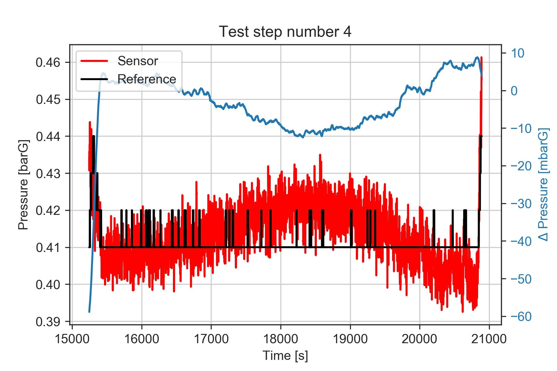
It seems that the deltaP oscillates between +8 and -10 mbar. We'd need to review what caused the pressure to oscillate during the test, and verify what level of accuracy we want to obtain from our results.
However, using the median value should still give us a robust indication of the central value seen during the test.
This figure highlights yet another thing to consider. The data from the reference instrument was recorded at a lower rate and with lower resolution than the data from the sensor we are evaluating.
Since we are comparing results recorded during stationary points, this shouldn't be a problem, but it's something worth investigating in case we want to measure data containing higher frequency content.
Conclusion
This approach I showed can be applied to analyze results from experimental tests including a sequence of stationary operating conditions. I've found that this is quite common in several applications.
For instance, when testing the continuous operation of an electric motor, we may do a sequence of steps at constant power. Or when characterizing the flow rate from an oil pump, we could measure its output at different operating regimes, or at different oil temperatures.
Regardless of whether you can use this method directly or not, I hope you found it useful as a practical example of how Python can be used to analyze data.
More reading: