What do people like to 3D print?
I try to determine what are the most popular types of objects for 3D printing, using data from Thingiverse REST API and different metrics.

What are the most popular types of objects for 3d printing?
It’s been more than a month since the last post. Recently, I have been busy making stuff and not writing about it - which is kinda against the whole idea behind this blog.
Around this time last year, my girlfriend and I created an Instagram account (@TwoThingies) to share the things we make with 3D printing at home. It’s been a fun journey since we started with the project and for sure I’ll write something about it later on in a different post. But for this one, let’s stay with the themes of Python and Data Analytics.
I’ve also been completing Google’s Data Analytics Professional Certificate so I thought it would be interesting to do something practical with what I’m learning. I decided to do some research about the trends in popular files for 3D printing, what types of objects are more popular, and by how much. This is, of course, an excuse to use some Python and analytics skills with real-world, non-automotive-related data. But I also was genuinely curious about the preferences of 3D printing enthusiasts.
Where to get the data? Thingiverse REST API
The first point was to find out what are the most popular things people print at home. I'm talking about makers and hobbyists. Both casual users and people who 3D print a lot of things. Not professional users working with additive manufacturing within specific industries. Also, I am not talking about recommendations, like "50 cool things to 3D print" or "what to 3D print this summer", but rather what data shows people like the most.
For industrial and professional users, there are different sources of information giving some insights. For instance, companies like FormLabs, 3DHubs, MakerBot and Sculpteo, and media platforms like 3D Natives have released annual surveys with their findings about trends in the Additive Manufacturing industry itself, or in the use of 3D printing within other industries.
Home or hobby usage, instead, is more difficult to measure. The obvious answer was: go to the source. I wanted to analyze the data from the platforms people use to obtain and share files for personal use or very small businesses.
There are many sites where people get their 3D-printable files online, but the biggest one is - by far - Thingiverse.com. Tens of millions of people visit the site every month, and, according to a quick search on SimilarWeb, that is more than 3 times the monthly traffic for the closest competitor, Cults3D.com. Even though Thingiverse suffers from a lack of proper maintenance and other issues, it is still by far the most popular site for sharing 3d printable models. Also, its the only platform for sharing 3D print files having an open REST API one can access to collect data about all the models uploaded to the site. Thus, I figured I could use it as a representative sample to find what people are 3d printing.
Findings
Using Python’s “requests” module, and Thingiverse’s REST API, I found out that by October 30th, 2022, there were 2155435 published models on the site. If you are curious to see how I gathered all the data, check out the code I used.
There were also:
- 75539318 likes
- 875899 “makes”
- 3144710 comments
- And there were at least 6304142 registered users - there’s no direct way to know how many of them are active on the platform - might be an interesting analysis for later.
Main categories of 3D printable objects on Thingiverse.com
The models are subdivided into 10 main categories, and I was curious to know how many models belonged to each one. So I made a pie plot to represent their share of the total number of likes, makes, and published things on the platform.
We can see that “3D-printing” and “Household” are by far the largest ones, with 22 and 20% of the total number of models published on the site belonging to them, respectively.
Next, I wanted to know how popular those categories are among users. To measure that, I could compare different indicators of user interaction. On Thingiverse, people can interact with a published model by giving it a like, downloading it, publishing a “make” (picture of the part they 3D printed using the files), commenting on it, and saving it on a collection.
Makes: Photos of 3D printed parts
The only way to know for sure whether a file has actually been printed is by looking at the “makes” published for that file. But I wonder how many people who download the files and print them actually go and publish a picture of their print. I’m guessing not a lot.
To find out, I analyzed the total number of published models, to see what portion of them have at least 1 make published. It turned out that there’s only an 11% chance that users will publish at least one make for a published model. Perhaps that's what they are trying to reverse at PrusaResearch with their new rewards system at Printables.com.
Anyways, I wanted to know what categories are more popular in terms of published makes. This brings another issue:
Having different numbers of models, I cannot compare directly the number of makes among the different categories. If you put a bunch of bins of different sizes next to each other and randomly throw plastic balls at them, the larger bins will end up with more spheres, just because they are larger. The categories here are “bins” of different sizes. Having more makes, likes or comments on one of them does not necessarily indicate that it is more popular than the others among people using the platform to get their files, not publishing.
I needed to account for the size of each category in order to make a fair comparison. To do that, I divided the number of makes of each category by the number of models uploaded to that category. I think of this metric as a “MakesDensity”, but this is really just the average number of makes for the models in each category.
\[MakesDensity = \frac{number \space of \space makes\space for\space category}{number\space of\space models\space for\space category}\]
Now I can answer my question. And it turns out that Toys and Games are by far the most popular models by this metric, as you can see in the figure below.
The most popular objects for 3D printing
The next way to measure whether an object has been printed is by looking at the number of times it has been downloaded. You need to download a file in order to print it. But I know many of us download files and end up not using them, so this is not a direct indicator. Besides, I could not find a way to gather the download information about the files on Thingiverse using their API or in any other way.
That leaves me with likes and comments as metrics for popularity. They really don't indicate what people are printing, but people are more likely to print something they like - not sure if they are likely to give a like to something they printed, though. Doing a similar analysis as before, I divided the like count for each category, by the number of models to get a useful metric - the average number of likes:
\[Average_{Likes} = \frac{number \space of \space likes \space for\space category}{number\space of\space models\space for\space category}\]
When comparing this with the total number of likes for each category, I get the results below:
As we saw before, most objects on the portal are in the “household” and “3D-printing” categories. For that reason, they have the largest number of likes. However, “Toys-and-games” shows the highest density of likes by published files - more than double of the next highest one, “models”.
Based on this data, we can say that Toys and Games are the most popular objects for 3D printing. Although we cannot really tell whether people are actually printing them, or just giving them a like while browsing the site for other stuff.
Also, I was curious to know whether that is because there are relatively few “toys-and-games” models with an insane amount of likes, or just because the people really like them and there are genuinely more likes per model in that category.
To find out, I plotted the empirical Cumulative Density Function of the like count for each category. In other words, the curves in the chart below answer this question: what portion of the existing models for each category have equal or less than X number of likes?
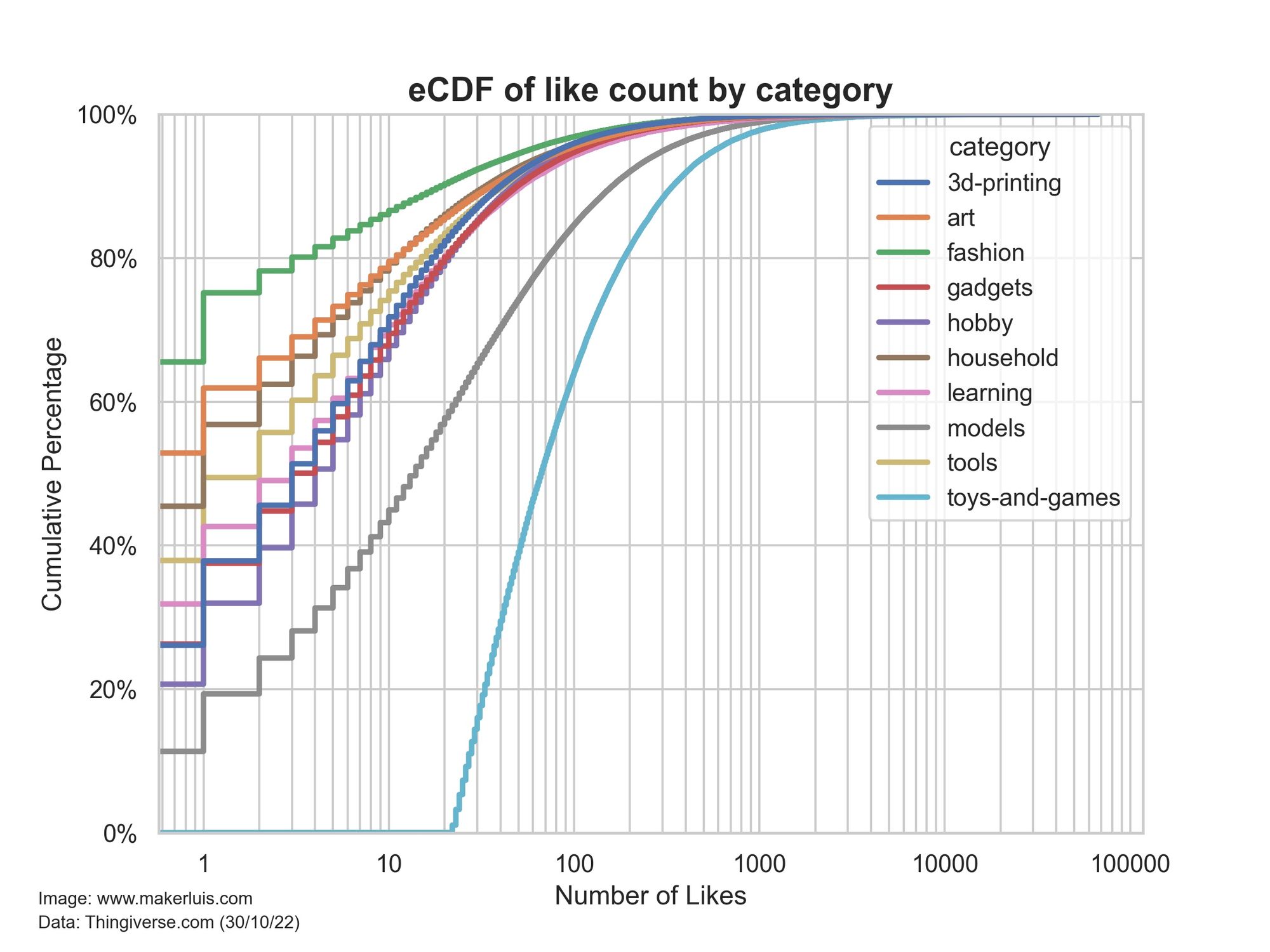
It turns out that Toys and Games are really a lot more popular than the other categories (at least on Thingiverse). Around 60% of the Toys and Games models on the platform have less than 100 likes. For the other categories, that number is above 80% in all cases. In other words, there is a 40% chance that a Toys and Games model has more than 100 likes, and for the other categories, there is only a maximum chance of 20% for the Models category.
But this analysis does not consider the time it takes for the models to receive those likes.
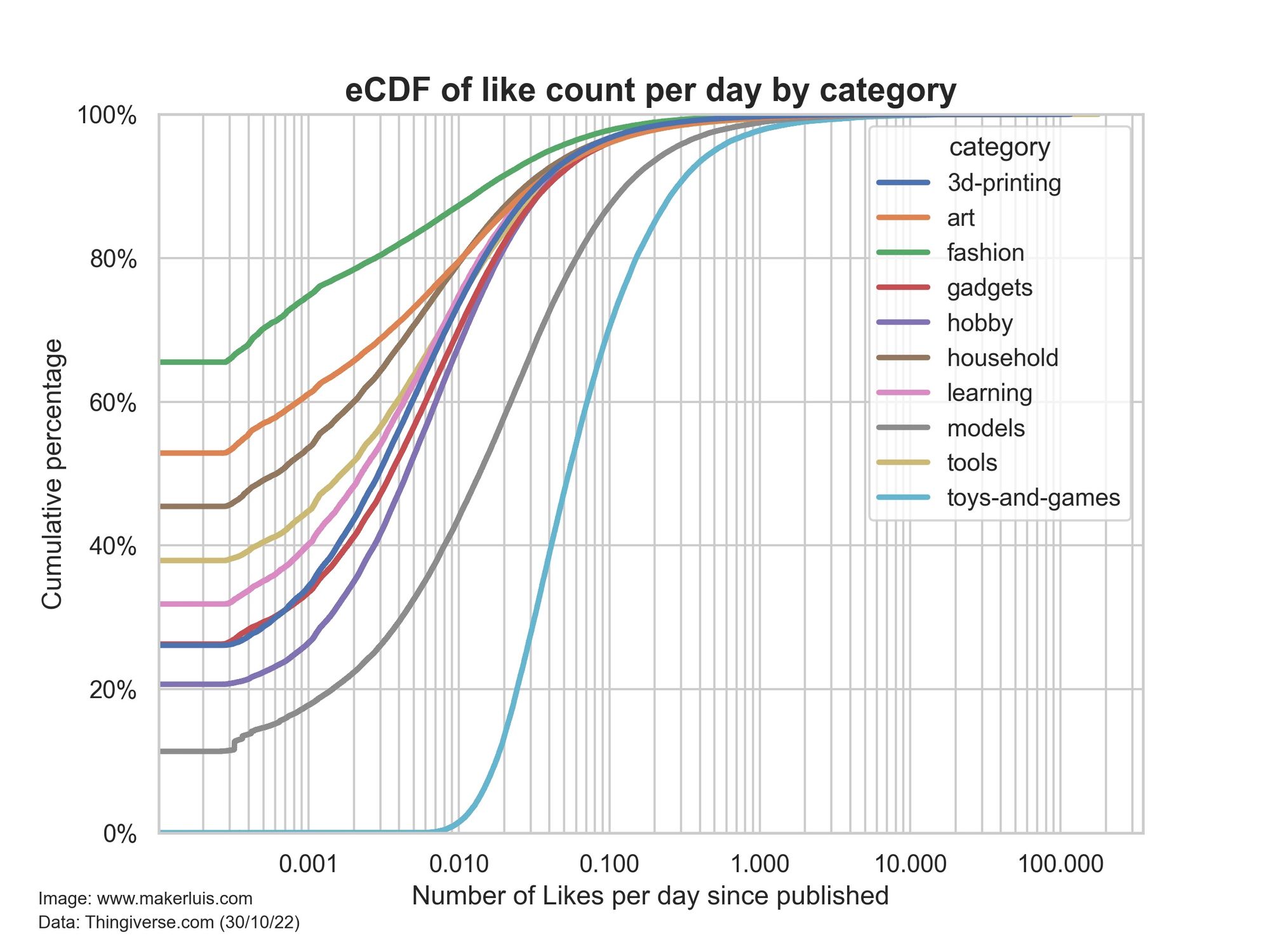
Number of likes per day received by 3D print objects
To analyze that, I divided the like count for each model by the number of days that passed since the day they were published and created another eCDF plot. Please notice the much smaller scale on the X-axis.
More than 90% of the models of all categories have an average of less than 0.1 like per day - that is 1 like every 10 days, except for Toys and Makes, and Models.
I think these are pretty interesting insights. Compared to Yeggi’s survey “What people search” conducted in 2013, this information also includes more recent data. Unfortunately, I left out the tags of each model when collecting the data, mainly because they created some issues when parsing the server responses as pandas data frames. I might run my script again to get more updated information (maybe at the end of the year) and do some analysis with the tags of the most popular models.
Also, the files found on Thingiverse.com are not only for 3D printing, but also for other digital fabrication processes, such as laser engraving and CNC routing, for example. So I guess the title should really be "What do people like to make?" or something like that (?).
I hope you liked this one! In the next posts, I will make other analyses, and go through the code I'm using to make this. So stay tuned if you’d like to see that.
Have a great day!