Data about 3D printing, with Python
I show you how I used Python to analyze the data from Thingiverse REST API, and I share more interesting facts I found, including rankings of 3D printable files.

Recently, I published a post titled "What do people like to 3D print?" where I shared some insights about the different categories of files for 3D printing on Thingiverse.com.
I've been having fun playing with the data collected using a Python script, based on Requests and Thingiverse's REST API. If you are interested, you can see the code here.
In this post, I'll show you how I used Python to obtain the results I mentioned in the previous one and create the interactive charts that I used to represent them. Then, I will share some rankings of 3D printable files based on the number of likes, makes and comments, and interesting insights about the usage of Thingiverse over the years. Keep reading if you are into 3D printing! Or if you are curious about Python in general - most of the code I will be using applies to any Pandas data frame.
If you are here for insights about Thingiverse data, jump to that section of the post.
Getting the data
Let's assume you used something like this python script to collect the data and store it locally on CSV files. I used tabs instead of commas as delimiters since some of the fields already had commas in them. For example, the name of some objects, like Christmas tree, snowflake profile. If you are wondering whether that is too much information to keep locally, my code saved a CSV file for all entries of each category, and the largest file was '3d-printing_bypopular.csv' occupying 156 Mb. Gathering the data from the whole site took me a couple of days of continuously running the script without turning my laptop off. I'm completely new to REST APIs and this is the first time I use one, so I had to do a bit of research online to learn how to get started. In case you are wondering, I'm sharing below some of the most relevant resources I used.
Resources I used to learn about REST APIs and how to use them with Python
When I started doing this, in mid-October, I really had no idea about what a REST API really is and how to use one using Python. I just wanted to analyze data about 3D printing trends and found that the only free and relevant source available - to my knowledge - was the API from Thingiverse.
I thought I could share with you the resources online I used the most to do this, in case you are in a similar situation. These are not in any particular order, I didn't really "study" REST APIs in depth, I just wanted to get things done:
- Python and REST APIs: Interacting With Web Services - Real Python
- Python Requests Module - W3Schools
- GET and POST requests using Python - GeeksforGeeks
- How to Use the Python Requests Module With REST APIs - Nylas
Special mention if you are more into video content:
- Working With APIs in Python - Pagination and Data Extraction - John Watson Rooney on Youtube (thank, master)
- How to use a Public API | Using a Public API with Python - Alex The Analyst on Youtube (thanks, really helped me understand that this is in fact not as complicated as I imagined)
Once I understood better how to get the data from the API, I ran my script and ended up with 10 files stored on my computer. I wanted to combine all the files in a single large data frame to make things easier. Here's how I did that:
import pandas as pd
import glob
import os

# Define folder where data is stored
# For simplicity, I kept it in a separate folder 'dataFolder' in the same
# location where my script was saved
# because of this, I can use a relative path to get the data

path = r'dataFolder'

# Get all .csv files in the folder
all_files = glob.glob(os.path.join(path, "*.csv"))

# Create a Pandas dataframe concatenating all the csv files
df = pd.concat((pd.read_csv(f,
                            sep = '\t',
                            encoding='latin-1',
                            usecols = [num for num in range(0,21)],
                            skipinitialspace = True).assign(
                            category=os.path.basename(f).split('_', 3)[-2]
                            )
                            for f in all_files),
                            ignore_index=True)
I got rid of the last columns ("page number" and "timestamp") which were not really important since I created them only for debugging the code. This is why I read the files specifying 22 columns to read.
That's it, I got a single data frame with all the data from Thingiverse. Pretty cool, huh? Anyways, I still needed to convert the dates into usable datetime objects. I also wanted to group the data by categories to make it easier to work with different metrics. That was easy to do with a few lines of code:
#%% Format the dates and create additional columns
df['created_at'] = pd.to_datetime(df['created_at'],
                    infer_datetime_format=True)
df['day'] = df['created_at'].dt.day
df['month'] = df['created_at'].dt.month
df['year'] = df['created_at'].dt.year
df['month_year'] = df['created_at'].dt.to_period('M')

#%% Group the data by categories
categories = df.groupby(['category']).sum()
Next, I wanted to know a few key parameters about the site. For instance, the total number of things, likes, comments and makes, which I mentioned in my previous post.
# Get total metrics for the whole site
total_number = categories.sum().is_published
total_likes = categories.sum().like_count
total_makes = categories.sum().make_count
total_comments = categories.sum().comment_count
I could have used the "main" dataframe to obtain these numbers, but working with a pre-grouped dataframe is much more computationally efficient - it was faster on my machine this way.
Visualizing the data
In this section, I'm going to share just two examples of the code I used to create the figures shown in my previous post. I'm focusing on the two types of charts I think were more difficult to make for me. If you want to see the results from the scripts below, go check them out:

Multiseries Interactive Pie Chart
To represent graphically the distribution of the whole site among the different categories in terms of likes, makes, and comments, I created an interactive nested pie chart showing the portion of the site occupied by each major category. Mainly thanks to this very useful comment on StackOverflow, which helped me understand how to do it using Pygal.
The outer ring represents the share of individual metrics such as the number of models, likes and makes for each category relative to the total numbers for the whole site. The center slices don't really add up to 100 %, since they are just the sum of the three outer series for each category, but they are helpful to visualize how the site is divided by categories, considering the three different metrics. Does that make sense? I think I just wanted to experiment with Pygal for fun :)
import pygal
from pygal.style import DefaultStyle
pie_chart_summary = pygal.Pie(width=600, height = 600,
                              style=DefaultStyle,
                              value_formatter=lambda x: "{}%".format(x))

pct_likes = (categories.like_count / total_likes) * 100
pct_makes = (categories.make_count / total_makes) * 100
pct_things = (categories.is_published / total_number) * 100

pie_chart_summary_condensed.title = 'Summary of the different categories on Thingiverse'
for category in ratio.index:
    pie_chart_summary_condensed.add(category,
                        [{'value': round(pct_things.loc[category],1), 									'label': f"Models share"},
                         {'value': round(pct_makes.loc[category],1),
                         	'label': f"Makes share" },
                         {'value': round(pct_likes.loc[category],1),
                         	'label': f"Likes share" }
                         ])

pie_chart_summary.render_in_browser()
Making the other pie charts was much more straightforward, I just needed to use the official documentation from Pygal.
Empirical Cumulative Distribution Functions (eCDF)
To make the eCDF plots instead, I used Seaborn - remember, I'm learning Python, so this whole thing is a learning exercise for me and I wanted to try different libraries.
import seaborn as sns
import matplotlib.pyplot as plt
from matplotlib.ticker import FormatStrFormatter

date = pd.to_datetime('30/10/2022')
date = date.tz_localize('UTC')
online =   date- df.created_at
df['likes_time'] = df.like_count / online.dt.days

fig, ax = plt.subplots(figsize=(8, 6))
sns.ecdfplot(data=df, x='likes_time',
                hue='category',
                ax = ax,
                log_scale = True)

ax.set_ylabel('Proportion')
ax.set_xlabel('Number of Likes per day since published')
ax.xaxis.set_major_formatter(mticker.ScalarFormatter())
ax.xaxis.set_major_formatter(FormatStrFormatter('%.3f'))
ax.grid(visible = True, which = 'both')
ax.set_title('eCDF of like count per day by category')
I hope these are good examples you could refer to or copy if you are looking to create something similar.
Now let's see some of the interesting facts I found.
More results
Let's complete the information I shared in the previous post where I looked at the distribution of published things, likes, makes, and comments among the different categories on Thingiverse.
Top 10 most liked models on Thingiverse by October 30th, 2022
Finding this was easy to do having a Pandas data frame to work with. I just needed to sort all things by their number of likes in descending order, and get the first 10 indices:
most_likes = df.sort_values(by = 'like_count', ascending = False)
top_10 = most_likes[['id', 'name', 'like_count', 'created_at']][0:10]
This is what I got:
| id | Name | Likes | Makes | Comments |
|---|---|---|---|---|
| 763622 | #3DBenchy - The jolly 3D printing torture-test by CreativeTools.se | 67362 | 4306 | 872 |
| 1179160 | V29 | 60233 | 1396 | 1067 |
| 1068443 | Digital Sundial | 56447 | 196 | 522 |
| 903411 | Self-Watering Planter (Small) | 55804 | 665 | 553 |
| 2194278 | Modular Mounting System | 53423 | 317 | 867 |
| 2050885 | Headphone Stand | 53086 | 436 | 347 |
| 42528 | 1.75mm Filament Clip | 52213 | 208 | 387 |
| 1743145 | The HIVE - Modular Hex Drawers | 52090 | 172 | 608 |
| 3495390 | Cute Mini Octopus | 51890 | 1649 | 1132 |
| 2656594 | All In One 3D Printer test | 49279 | 201 | 420 |
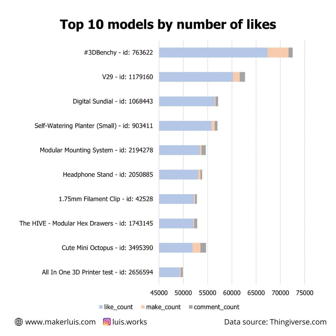
I have to say, I wasn't really surprised about the 3D Benchy being the all-time most-liked model (update on 2022/12/09: the 3D Benchy is no longer available on Thingiverse). It even has a dedicated website. It has really become a symbol of FDM 3D printing. What surprised me was the other models in the top 10. If you are curious, the V29 is a fully 3D-printed 118db emergency whistle!
Top 5 models by number of makes
| id | name | Likes | Makes | Comments |
|---|---|---|---|---|
| 763622 | #3DBenchy - The jolly 3D printing torture-test by CreativeTools.se | 67362 | 4306 | 872 |
| 2014307 | Baby Groot | 44915 | 2435 | 696 |
| 215703 | 3D Hubs Marvin - Key Chain | 7229 | 2094 | 82 |
| 2440907 | emlyon rocket kit | 358 | 1909 | 29 |
| 3495390 | Cute Mini Octopus | 51890 | 1649 | 1132 |
Top 5 models by number of comments
Comments seem to be more frequent for objects that involve building or modifying machines - objects related to projects.
| id | name | Likes | Makes | Comments |
|---|---|---|---|---|
| 2759439 | Petsfang Duct for CR10 MicroSwiss/Stock/E3Dv6/Volcano/TevoTornado /Tarantula Hot End/E3Dv6 CNC Mount & 5015 fan Bullseye Blokhead | 14738 | 476 | 5561 |
| 1752766 | HyperCube 3D Printer/CNC | 13308 | 220 | 3171 |
| 3249319 | Anycubic i3 Mega / Mega-S Marlin 1.1.9 Custom Firmware - Extra Features & Quality Tweaks | 2184 | 13 | 3135 |
| 1001065 | D-Bot Core-XY 3D Printer | 7060 | 143 | 2853 |
| 2349232 | Drawing Robot - Arduino Uno + CNC Shield + GRBL | 9242 | 50 | 2284 |
More details: rankings for models and keywords
I'm preparing a package containing the full rankings for all major categories on the site, as well as specific topics, like Cosplay and props, miniatures, DIY projects, figurines, jewelry, and others. I'll tell you more about that in a future post. Subscribe to stay tuned!
Number of likes for all models published on the site
I wanted to represent the likes for all models created up to October 30th, 2022, when I finished collecting the data. To do that, I made a scatterplot using Seaborn.
#%% Popularity of all published items on Thingiverse
import seaborn as sns
import matplotlib.pyplot as plt

fig, ax = plt.subplots(figsize=(16, 9)) #8, 6

sns.scatterplot(data = df, x = 'created_at', y = 'like_count',
                hue = 'category', ax = ax, edgecolor="none", alpha=1)

x_benchy = most_likes.iloc[0].created_at
y_benchy = most_likes.iloc[0].like_count


plt.annotate(
      '3D Benchy',
      xy=(x_benchy, y_benchy), xytext=(55, -20),
      textcoords='offset points', ha='left', va='bottom', fontsize=18,
      bbox=dict(boxstyle='round,pad=0.5', fc='yellow', alpha=0.5),
      arrowprops=dict(arrowstyle='->', connectionstyle='arc3,rad=0')
            )

leg = ax.legend(title = 'Category', edgecolor = 'black',
                fontsize = 15, fancybox = False,
                loc = 'upper right')

plt.rcParams.update({'axes.grid': False,
                    'xtick.labelsize': 18,
                    'ytick.labelsize': 18,
                    })

plt.rcParams.update({'legend.title_fontsize': 18})

ax.set_ylabel('Total Likes', fontsize=22, fontweight="bold")
ax.set_xlabel('Date published', fontsize=22, fontweight="bold")
ax.grid(visible = True, which = 'both')
ax.set_title('Popularity of Thingiverse models',fontsize=28, fontweight="bold")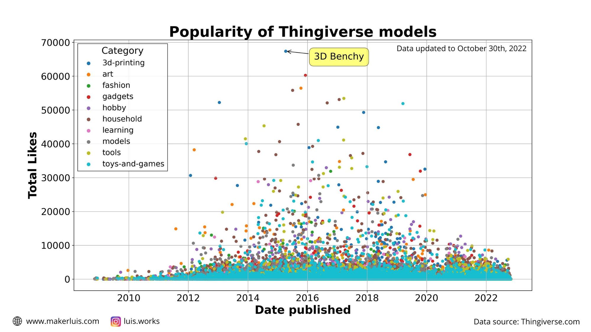
Please note that, since the data for each category was plotted sequentially, the light blue dots for "Toys and Games" are simply on top of the rest.
Interestingly, it seems like there haven't been ultra-hyped-popular models with more than 20000 likes since 2019. I really don't know why, there are too many factors to consider!
The idea here is just to highlight when the most popular models were published, because I've already analyzed the total share of each category in terms of the total number of models, likes, and makes published on the site. On the other hand, this is how the top 1% of most-liked models on the site are classified.
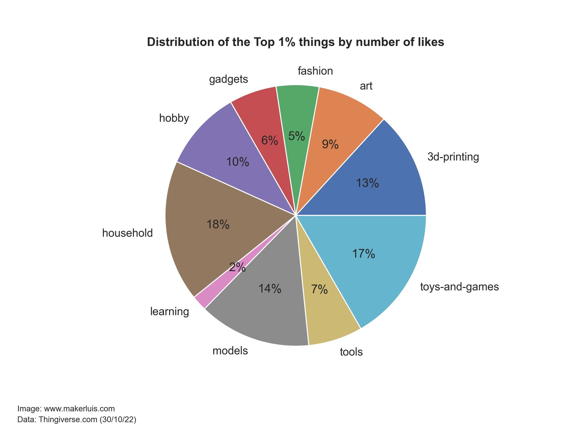
Even though there are far fewer Toys and Games models than 3D printing-related objects and Household things, 17% of the most liked items are classified as toys. This confirms what I showed before: Toys are what people like the most on Thingiverse, despite the fact that they are not what most people are publishing, judging by the number of published objects.
However, this made me wonder about how the number of published models on the site has evolved over time.
Monthly number of published models over time
I wanted to represent the evolution of the total number of new models published every month, since the creation of the site. This would give an idea of how is the site being used for sharing models, and whether there are relevant trends recently.
To make this, I iterated through the different categories and grouped the models belonging to them by the month and year when they were published. Then, I plotted the sum of published items for each month and year.
fig, ax = plt.subplots(figsize=(16, 9))

plt.rcParams.update({
                    'xtick.labelsize': 18,
                    'ytick.labelsize': 18,
                    'legend.title_fontsize': 18
                    })

for category in categories.index:
    data_category = df.loc[df['category'] == category]
    data_years = data_category.groupby(['month_year']).sum()
    data_years = data_years.reset_index(level=0)

    # create timeseries plot
    # sns.lineplot(data = data_years, x="month_year", y="is_published" )
    data_years.plot(x= 'month_year' , y="is_published",
                    figsize=(16, 9), ax = ax, label = category,
                    grid=True, x_compat=True)

plt.xlabel("Date",  size = 20, fontweight="bold")
plt.ylabel("Published Models (Things)", size = 20, fontweight="bold")
plt.title("Number of things published on Thingiverse.com vs time", size = 25, fontweight="bold")

leg = ax.legend(title = 'Category', edgecolor = 'black',
                fontsize = 15, fancybox = False,
                loc = 'upper left')

ax.grid(visible = True, which = 'both')
fig.show()
I'm sure there is a better way to create this plot, but I was pleased with the result anyways - would love to hear any comments about the code!
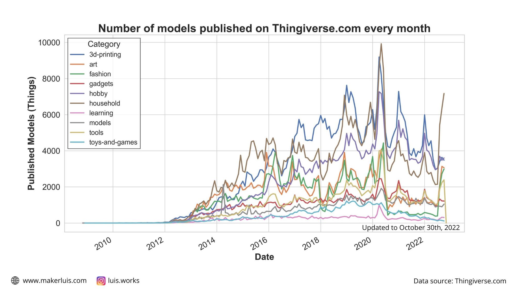
It's even possible to spot the lockdown period without looking at the dates - people closed at home with 3D printers caused an all-time spike of published models in 2020. I would like to know more about the time when the likes, comments, and makes are created by users - I bet the number of downloads for pandemic-related problems rose a lot in that period. Unfortunately, the API does not offer that kind of information - also, it would be a huge amount of data, I think.
Besides the 2020 spike, it seems like there is some seasonality to the number of models published, with peaks around the winter months for the northern hemisphere. My guess is that people spend more time indoors during that time of the year, and thus they have more time to create new models and share them online. Just a guess, though!
Another interesting result: even though Toys and Games are the most liked type of objects, fewer 3D printable toys are being published recently.
Wrapping up
In this post I mixed - maybe too much, two topics I really like: 3D printing and data analytics. I think the results I found could be interesting for other people in the 3D printing community, so I will do another post with more detailed analyses people might find useful and less Python code. For instance, I've seen discussions about whether Thingiverse is really being abandoned or not, and that's something I'd like to analyze better. Also, someone asked me on Reddit what would cosplay armor and props be classified under. That's an interesting question - also for other topics. So I'm going to take some time to dig into that - I'll need to learn how to do keyword analysis based on the descriptions of the models, and re-run my script to gather the data including the tags, which I naively discarded during the first run.
For now, if you'd like to see some facts about the data, other than the general visualizations I showed, make sure to check out my previous post:
In this one, I shared more concrete facts about the data. It's focused on insights and there are no Python code snippets ;)
Thank you so much for reading and I hope you enjoyed it!
Have a great day!